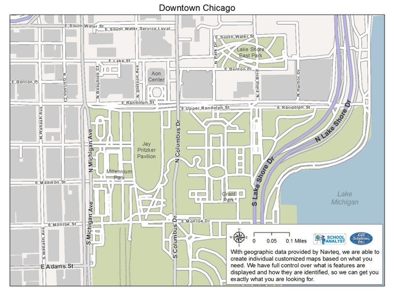
Custom Maps
Maps showing your custom boundaries
How can I learn about my attendance boundary?
Maps are an effective way to turn data into information. Maps give you a visual overview of your area of interest, allowing you to quickly become familiar with the demographics of your boundary. Visualizing the demographics spatially can help identify trends that are not apparent in databases and spreadsheets.
Using a map sounds pretty good. What kinds of maps are available?
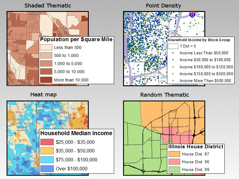
Along with a map of your attendance boundary showing streets and other geographic features, a few examples of maps we provide are heat maps, shaded thematic maps, or point density maps. Each type of map displays the information differently, and is useful in certain circumstances. We will work with you to understand what you are trying to learn, and how best to present the information to you.
- Heat maps provide gradual changes between data points.
- Shaded thematic maps show exact measurements.
- Point density maps use density for representation.
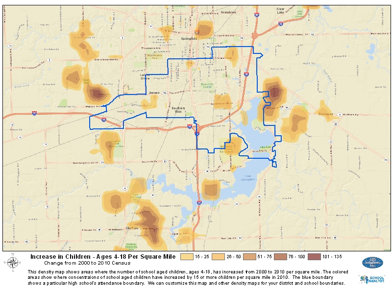
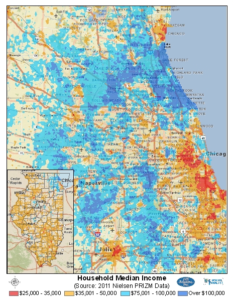
A heat map sounds useful, I'm interested in seeing the median income in my attendance boundary. Can you tell me more about it?
Heat maps show gradual changes for one demographic variable. Using the center of census blocks as the initial data points, the value for the area between points is calculated. The calculation takes into account the values of the surrounding blocks, and the distance to the center of the block. This provides an informative map that shows trends over a large area.
- Visualize trends spatially
- Include custom or public boundaries or locations
- Useful for showing one attribute at a time
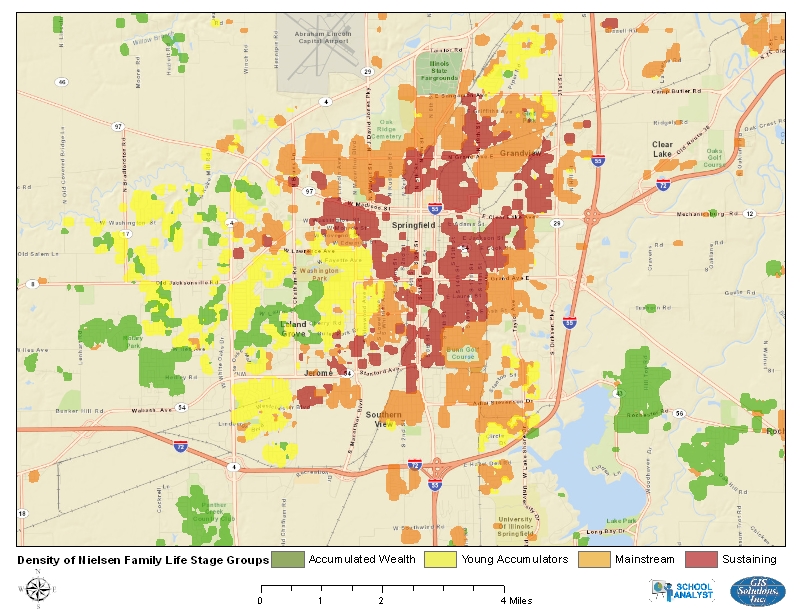
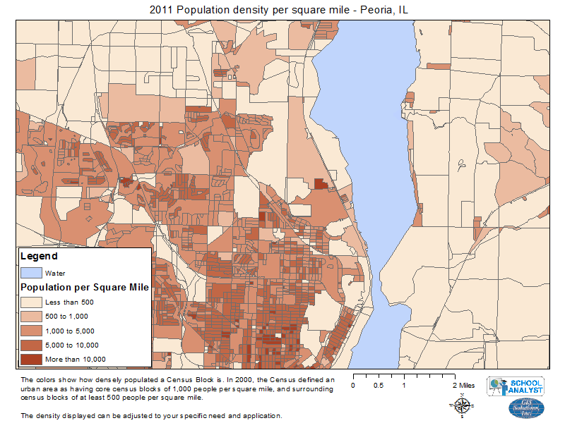
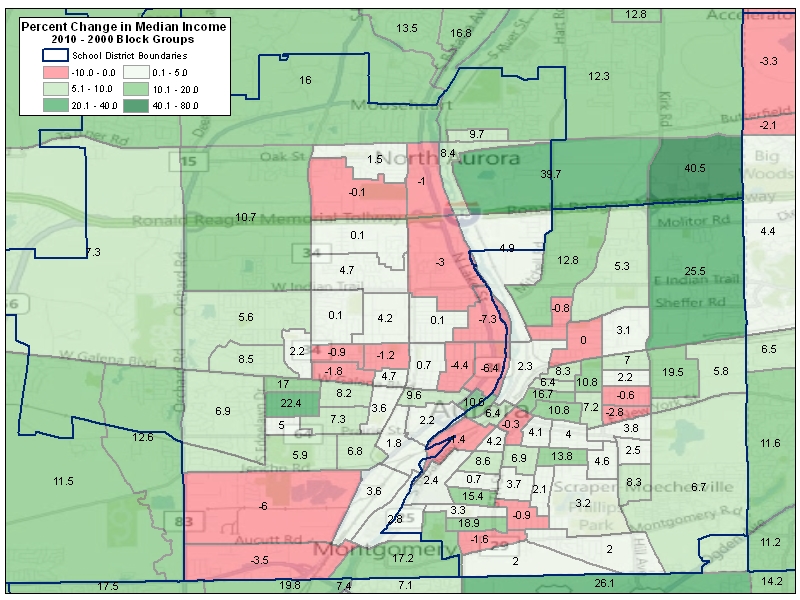
A shaded thematic map is for me, I need to know the population density by census block in my attendance boundary. Can you tell me more about it?
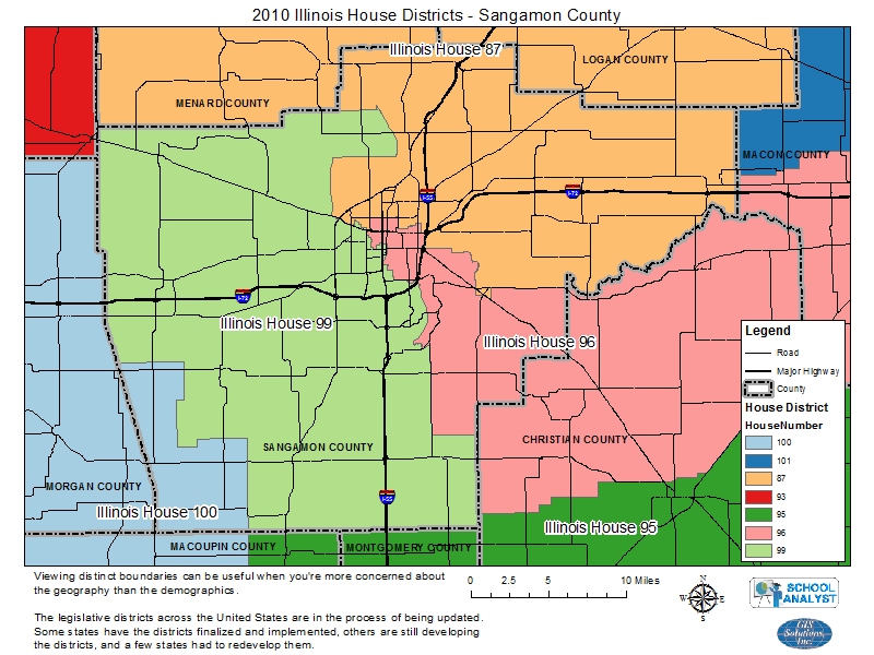
Shaded thematic maps show the values of a demographic variable for a defined boundary, commonly done with blocks or block groups. We are able to apply this to any boundary, such as school boundaries, legislative boundaries, or custom boundaries. The goal of a shaded thematic map is to represent the value of the demographics using logical color patterns. Depending on the map, the colors might fade from light to dark, or a pattern such as changing from green, to yellow, to red.
Thematic maps are also useful for seeing distinct boundaries. Sometimes you want to see your boundaries over a street layer, so you can easily identify the edges of your boundaries. Other times you want to see you boundaries on a higher level in relation to lakes, counties, or state boundaries. This can be accomplished using thematic maps with different colors for each boundary or boundary edge.
- The variable's population size is shown by a color's hue
- Different variables are represented in different colors
- Useful for showing one attribute at a time
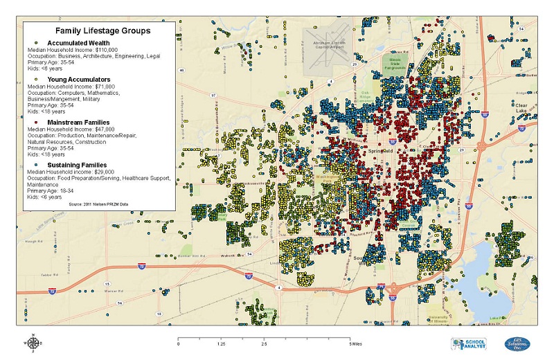
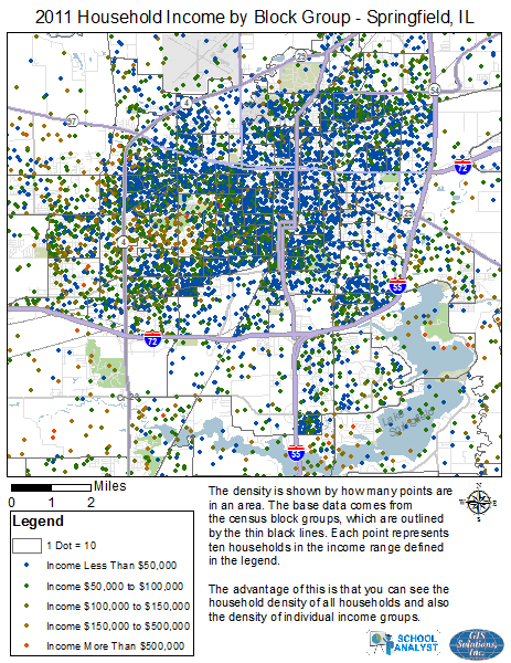
The point density map sounds interesting, I'd like to see the population density and races within a census block. Can you tell me more about it?
Point density maps are an effective way to show the density of multiple populations on a single map. This is effective for showing the population density along with the density of races, household density with the density of different household incomes, or other demographic variables with subvariables.
The density is shown by looking at all of the points, and the different variables that make up the overall population is shown in different colors. This lets you see the density, along with the density of each individual group.
- Represents the density of one or more demographics
- Gives insight that would need multiple maps otherwise
- Able to show multiple variables
What geographic data do you have available to include on the maps?
We use geographic data from Navteq to create the features you see on the map. Navteq is a world leader in providing geographic and location data, and is used in Garmin GPS units, Microsoft Bing maps, and many other applications. There are a wide range of geographic features that are available from Navteq, including:
- Roads
- Railroads
- Rivers, Lakes, and Oceans
- City, County, State, and National boundaries
- Zip code boundaries and Zip+4 locations
What demographic data do you have available?
Nielsen is the primary provider of demographic data that we use to add information to geographic features. In addition to demographics from Nielsen, we also use the latest 2010 Census data. Nielsen is a world leader in measuring and compiling demographic information, and we use their data at a variety of geographic levels. From Nielsen, we have a wide range of demographic data at the block group, block, and even individual household level. The Pop-Facts data provides information about the population and households within the block group, including:
- Race and ethnicity
- Age identification
- Income brackets
- Educational Attainment
- Employment status and industry
You mentioned individual household demographics, can you tell me more about those?
Nielsen provides one of sixty-six PRIZM classifications at the household level. Each of these sixty-six PRIZM categories is also generalized into broader categories, which show the stage in life a household is, such as an established family or retired couple, and also the social setting of the household, such as an urban or rural city. The variables available for the PRIZM classifications are similar to the Pop-Facts, but not as detailed.
We can display the raw data, or use it as part of a demographic analysis. Depending on what you are looking for, different representations of the data are useful. When looking at a neighborhood, it can be useful to see the individual points, but at the county level that would be too much information. At higher geographic levels, we can highlight concentrations of specific PRIZM segments or show the predominant PRIZM segments for an area.